Friday, 19 January 2018
CD progress
Thursday, 18 January 2018
Advert poster progress
CD package progress 3
Here, I was experimenting with different fonts and layouts. I seemed to like the scattered/tilted letters to represent the childish theme of the artist and the album. I want to change the font colours however, in order to relate to our colour scheme.
Wednesday, 17 January 2018
Spine progress
I decided to rotate the shape of the spine sideways to make it easier for me to work and create text, then I would rotate it back afterwards.
Tuesday, 16 January 2018
Monday, 15 January 2018
CD package progress 1
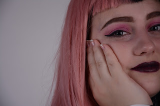
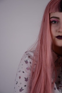
I used Photoshop to create my CD package, using the clone stamp tool I erased the hair sticking up, this was to make it look more neat and front cover ready. I used the spot healing brush tool to smooth and blend out the unnecessary untidiness from the hair. I also used the same tool to smooth out the face, making sure it looked professional and polished.
I had to crop and place the image so that the hands/arms were covered, and so that the image filed the cover.
Friday, 12 January 2018
Thursday, 11 January 2018
Subscribe to:
Comments (Atom)


