Thursday, 15 February 2018
Wednesday, 14 February 2018
Evaluation Q1
In what ways do your media products use, develop or challenge forms and conventions of real music products?
Thursday, 1 February 2018
Additional case studies
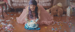
Melanie Martinez- Pity Party...
Most of our themes from our music video are very similar to Melanie Martinez's Pity Party. She uses the concept of sane v insane and is portrayed as a very 'unique' artist.
Her motifs such as the teddy/toys, cakes, wig have also been used in our music video. We have the same niche audience, which can easily recognise the artist through her recognisable props and motifs.
She is overly childish and doesn't seem as though
your stereotypical young artist.
Her wig is a trademark as well as her dress code (pink, girly colours, childish dresses) Visual trademark.
This is all to make the music video more recognisable, it is a marketing strategy to be remembered
Halsey-Ghost...
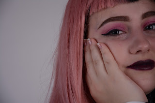
I found many similarities with this music video and artist compared with mine. I recognised the similar use in mise-en-scene straight away, props such as the wig was used to represent her as a star and gain recognition. The manipulation of light to represent the mood related well with my music video also.
Most of our themes from our music video are very similar to Melanie Martinez's Pity Party. She uses the concept of sane v insane and is portrayed as a very 'unique' artist.
Her motifs such as the teddy/toys, cakes, wig have also been used in our music video. We have the same niche audience, which can easily recognise the artist through her recognisable props and motifs.
She is overly childish and doesn't seem as though
your stereotypical young artist.
Her wig is a trademark as well as her dress code (pink, girly colours, childish dresses) Visual trademark.
This is all to make the music video more recognisable, it is a marketing strategy to be remembered
as authorage reinforces ‘star quality’ and can be iconic.
Halsey-Ghost...
I found many similarities with this music video and artist compared with mine. I recognised the similar use in mise-en-scene straight away, props such as the wig was used to represent her as a star and gain recognition. The manipulation of light to represent the mood related well with my music video also.
Friday, 19 January 2018
CD progress
Thursday, 18 January 2018
Advert poster progress
CD package progress 3
Here, I was experimenting with different fonts and layouts. I seemed to like the scattered/tilted letters to represent the childish theme of the artist and the album. I want to change the font colours however, in order to relate to our colour scheme.
Wednesday, 17 January 2018
Spine progress
I decided to rotate the shape of the spine sideways to make it easier for me to work and create text, then I would rotate it back afterwards.
Tuesday, 16 January 2018
Monday, 15 January 2018
CD package progress 1
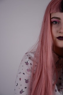
I used Photoshop to create my CD package, using the clone stamp tool I erased the hair sticking up, this was to make it look more neat and front cover ready. I used the spot healing brush tool to smooth and blend out the unnecessary untidiness from the hair. I also used the same tool to smooth out the face, making sure it looked professional and polished.
I had to crop and place the image so that the hands/arms were covered, and so that the image filed the cover.
Friday, 12 January 2018
Thursday, 11 January 2018
Subscribe to:
Comments (Atom)


